Tiara Ansilla
Tiara Ansilla
Frame 001 / animator → UI/UX designer

Drawing every frame to designing every scroll.

I'm Tiara, a UI/UX designer in Chennai who started out in 2D and 3D animation. Animation trained my eye for timing, motion and the tiny details people never notice, but always feel. Today I bring that to product design, with an AI-assisted workflow that takes ideas from sketch to prototype faster.

Open to UI/UX and product design roles

Drag the playhead to see how a screen comes together

Worked withBeing UltimateJayachandran TextilesOptima ResponseiGene Entertainment
The story so far

From keyframes to user flows.

I didn't switch careers so much as zoom out. The same questions I asked as an animator, where does the eye go, what happens next, how should it feel, are the ones I ask of every screen.

Tap a year to read the story
What animation taught me about good UX.

Principle · timing

Micro-interactions that feel right

I know the difference between 200ms and 400ms, because I've counted the frames.

Principle · anticipation

Show what's about to happen

Clear affordances, previews and feedback, so users are never surprised by a tap.

Principle · storyboarding

Every flow is a storyboard

I sketch the user's journey shot by shot before I ever open Figma.

Principle · secondary action

The small stuff is the big stuff

Loaders, empty states and hovers are where products quietly earn trust.

Selected UX work

Design stories.

Filed under: things that shipped, and ideas I couldn't stop thinking about.

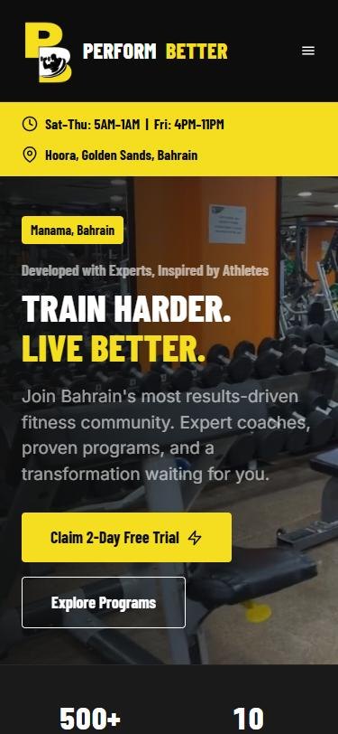
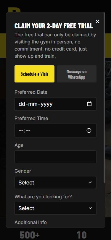
Perform Better home screen on mobileFree trial popup on mobile
Website · AI-assisted build · admin hub

Perform Better Fitness Center

A high-energy website for a 500+ member gym in Manama, Bahrain, with a simple admin hub so a non-technical owner can update offers, timings and photos himself.

2-path free trial flow14 member transformationsFeedback & complaints inbox
Read the case study →
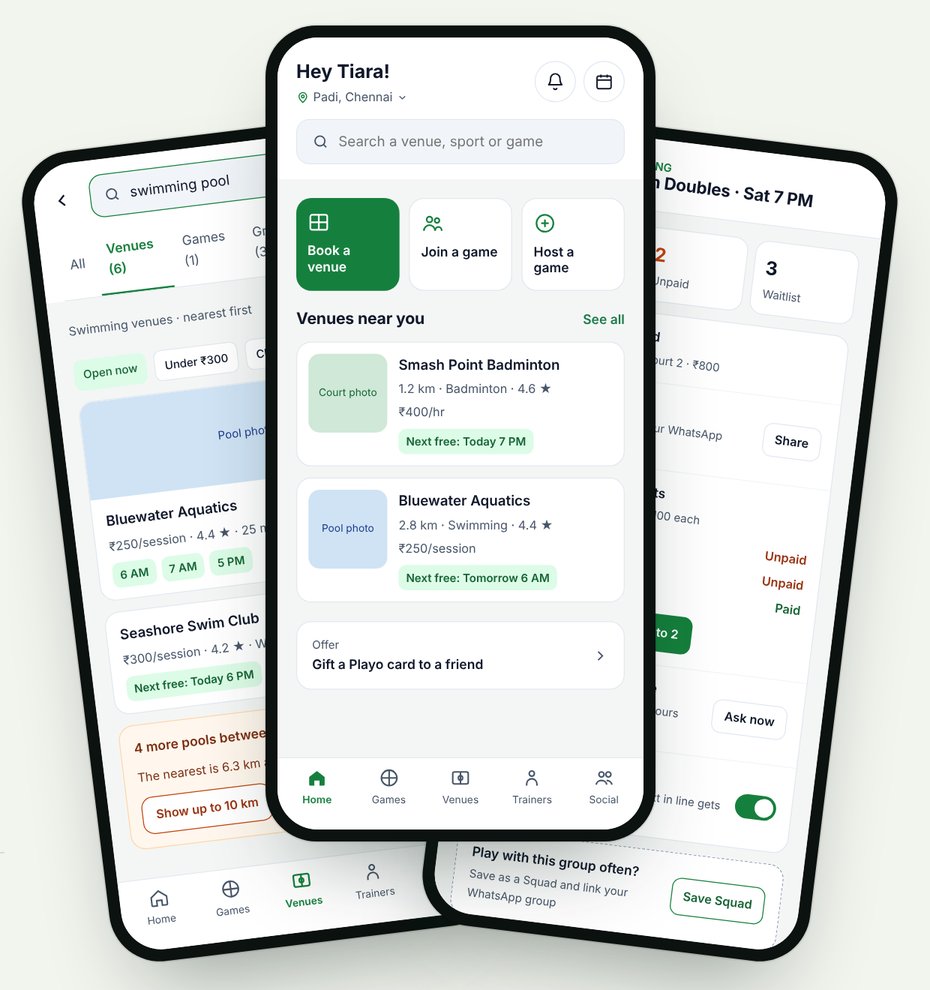
Redesigned Playo screens: search results, home and hosting
UX audit + redesign · survey · heuristic review

Playo: finding a venue shouldn't need Google Maps

I searched "swimming pool" on Playo and landed on the Games tab. A player survey and a screen-by-screen heuristic audit turned that into nine friction points, and six redesigns that fix all of them, from intent-aware search to UPI payment collection for hosts.

9 friction points mappedIntent-aware searchHost payments + waitlist
Read the case study →

From college

Loyola College · 2021–2024
How I work

Hand-drawn thinking, AI-assisted speed.

AI takes on the busywork so more of my time goes to the parts that need a human eye: the people, the story and the details.
01

Research

AI helps synthesise interviews and competitor audits into patterns.

02

Sketch

Storyboards and flows, always by hand first.

03

Design

Figma for UI, with AI for copy variants and edge cases.

04

Prototype

Framer and AI build tools turn designs into working sites fast.

05

Test

Real people, real feedback, then another pass.

In my bag FigmaFigma MakeFramerClaudeAdobe XDIllustratorPremiere ProAutodesk MayaSketchBookHTML & CSS
Visual & motion work

Where the eye for detail comes from.

Before UX, I spent years storyboarding, animating, modelling in 3D and drawing. It's still how I think through a screen.

See all visual work →

Want to connect?
Let's start building.

© 2026 Tiara AnsillaDesigned by Tiara
← Back to homeVisual & motion work · 2019 onwards

Frame by frame.

Storyboards, 2D and 3D animation, modelling, portraits and social creatives. This is the work that trained my eye for timing, framing and the small details, and it still shapes how I design interfaces today.

01 · Storyboards

Every shot planned before it's made.

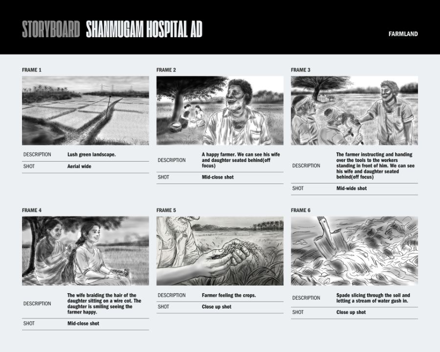
Shot lists with framing and descriptions, the same way I now map user flows screen by screen.

Shanmugam Hospital ad Sketchbook and Gemini AI · 2026

Frames 1–6: farmland
Frames 7–12: to the hospital

Real estate ad Adobe Illustrator

Site plan to entrance
Arrival

Baking class ad Adobe Illustrator

Walking to class
Into the candy world
02 · 2D animation & character design

Characters that move with a reason.

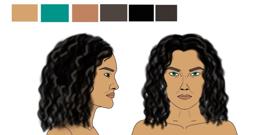
Turnarounds, expressions and poses drawn for 2D animation projects, including "Online classes" and "The Dream".

2D loops Frame-by-frame loop animation

Sports loop Golf swing to pool break · 20 s
Bomb loop Bounce, squash, stretch and blast · 40 s

More character work

Background and character scene
Character design with palette
Pose study
Pose from reference
03 · 3D modelling & animation

Built, rigged and lit in 3D.

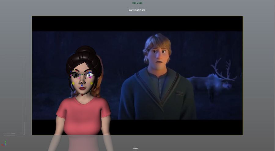
Autodesk Maya work, from hard-surface props and environments to rigging, layout and a lip-sync scene.

Lip-sync scene, final
Lip-sync scene, blocking
Layout pass
Layout, final
Character poses
Character model
Environment
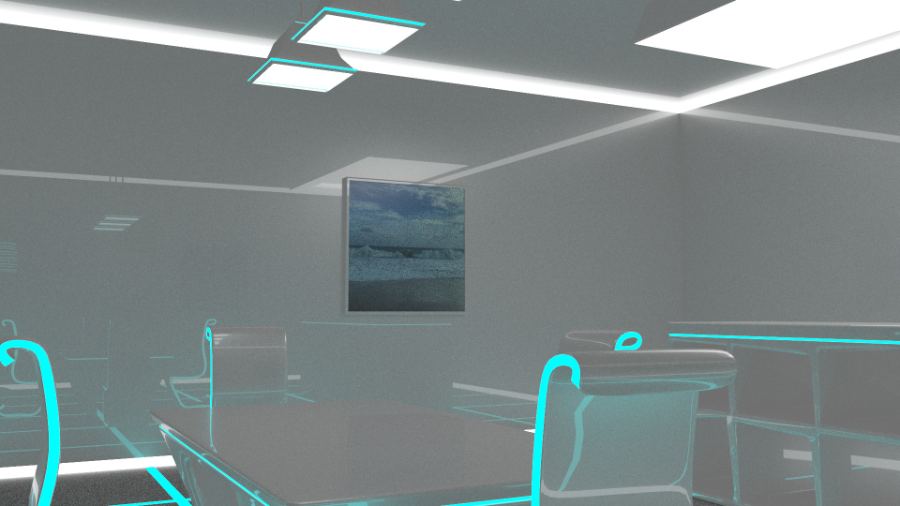
Interior inspired by Tron Legacy
Prop: kitchen knife
Prop: water bridge
Prop: bow and arrow
04 · Digital portraits

Painted, not photographed.

Digital fan portraits, focused on likeness, lighting and texture.

Gojo Satoru, Jujutsu Kaisen
Tyrion Lannister, Game of Thrones
Lucifer
05 · Social media creatives

Earning attention in two seconds.

Full carousels for Being Ultimate, Discourt and India Ultimate, shown slide by slide. Scroll sideways through each set and tap any slide to enlarge it.

What is Being Ultimate?

Being Ultimate · explainer carousel · 4 slides

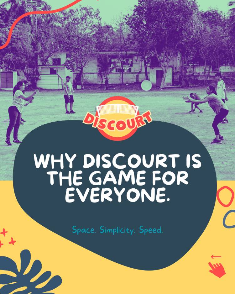
Why Discourt is the game for everyone

Discourt · carousel · 5 slides

The psychology of becoming an influencer

Being Ultimate · carousel · 5 slides

Election campaign for India Ultimate

India Ultimate · carousel · 7 slides
06 · Optima · Camerry Ice Cream

Scoops, puns and festivals.

Posts and reels I made for the Camerry Ice Cream brand while I was at Optima: flavour launches, festival greetings and a lot of wordplay, in English and Tamil.

Reels

World Ice Cream Day Reel · 30s
Navaratri festive reel Reel · 35s
Camerry and FAFA Reel · 14s
Boyfriend or Camerry? Reel · 8s
Broken heart? Fix it with dil se Square reel · 9s
Stressed spelled backwards Square reel · 12s

Posts

07 · Motion reels

Watch it move.

Each reel opens in Adobe's video player in a new tab.

08 · Research

The Portrayal of Gender in Pixar Theatrical Shorts.

My M.Sc dissertation, a quantitative content analysis. It found male characters were over-represented and central to the story, with far more screen time than female characters, and argues for more balanced representation in children's media.

Why it matters for UX

Counting who gets seen, and for how long, is the same habit I bring to research now: look at what's actually on screen, not what we assume is there.

← All work
Case study · website design

Perform Better Fitness Center

A high-energy website for a Bahrain gym with 500+ members, built so a non-technical owner can run it on his own.

Visit the live site ↗
ROLESolo: research, design and build
TIMELINE2 weeks
TOOLSClaude Code, Vercel
CLIENTMy dad's gym, Manama
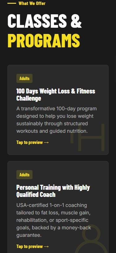
Classes and programs
Home: Train harder, live better
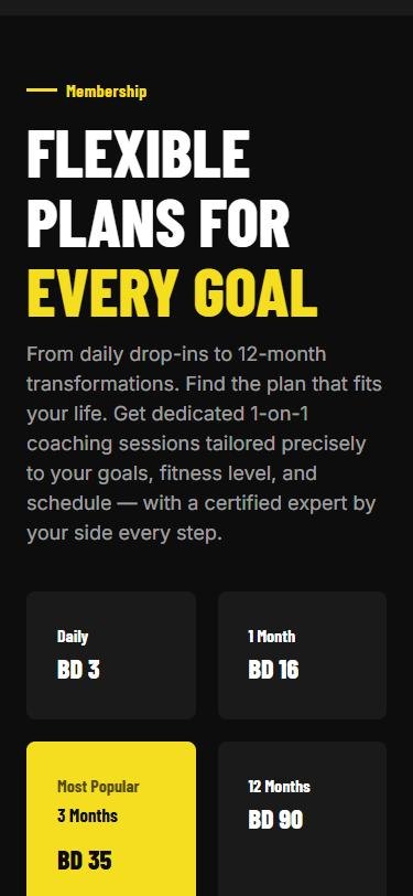
Membership pricing
In short
Problem

The gym had no website, so the owner's phone rang all day with the same questions from new joiners.

What I did

Designed and built a site in 2 weeks that answers those questions up front, and sends the owner a short brief when someone still needs to talk to him.

Result

Live at performbetterfitnesscentre.com. Early testers said it feels like a premium gym's website.

The challenge

Sell the energy. Hand over the keys.

The gym is my dad's, so I saw the problem every day. With no website, every new joiner and every question came in as a phone call, and he answered them all himself. I wanted the site to answer as much as possible before anyone picks up the phone.

It also had to feel like walking into a workout: loud, bold and full of motion. And the person keeping it updated isn't techy, so every offer, timing change and new photo had to be something he could change himself, without calling a developer.

Equipment and gym walkthrough
Timings, offers and promotions
Gallery, staff and owner story
Feedback form with photo upload
Research · other gym sites

Earn trust before the price.

I studied how other gyms sell online. The ones that worked told visitors what they came to hear first, then showed proof from real members, and only then asked them to pay.

What you'll get→Testimonials→Pricing

That order shaped the whole homepage: programs first, real member transformations next, pricing last.

Decision 01 · information architecture

Cutting the menu to four.

Ten pages meant ten decisions for a visitor who just wants to know "can I train here?" I grouped pages by what people are actually asking.

Before · 10 items
HomeAboutStaffFacilitiesGalleryClassesPersonal TrainingPricingSuccess StoriesContact
After · 4 items

Home · programs, member stories and plans in one scroll

About · absorbs Staff, Facilities, Gallery

Pricing · full table, incl. couple and F50 rates

Contact · timings, location, feedback form

Classes and Personal Training moved onto Home, so the free-trial button is never more than a scroll away.

Claim your 2-day free trial popup with Schedule a Visit and WhatsApp tabs
Decision 02 · conversion flow

One button, two kinds of people.

Some people like to plan a visit. Others want an answer right now. "Claim 2-Day Free Trial" opens one popup with two tabs, so nobody is forced through a form that doesn't suit them. The first line removes the fear: no commitment, no credit card, just show up and train.

Why it cuts calls: both paths collect a short brief first, so when a message reaches the owner he already knows who it is and what they want, and can reply in one go.

Path A · the planner
Date, time, age, gender, goal→Visit request on WhatsApp→Train free for 2 days
Path B · the ask-now
Name, age, gender, notes→Pre-filled message to the gym's WhatsApp
Decision 03 · nine programs, one scroll

Tag it, then let people peek.

Nine programs is a lot to read. Each card gets a clear Adults or Adults & Kids tag, so parents find family classes at a glance, and "Tap to preview" opens a short video of the class. Seeing a Zumba session sells it better than any description.

100 Days ChallengePersonal TrainingF50 FunctionalSpinningZumbaKickboxingDanceBoot CampSwimming
500+members
15+years of experience
1,000+lives changed
BD 3daily drop-in, up to 12-month plans
Decision 04 · proof before price

Real members, real numbers.

My research said people trust other members more than the gym's own claims, so a Transformations carousel now sits right between the programs and the prices. Visitors meet the proof just before they're asked to pay.

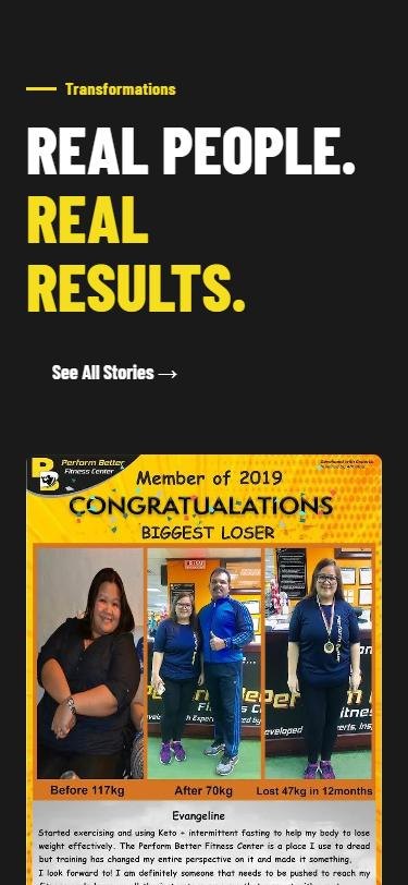
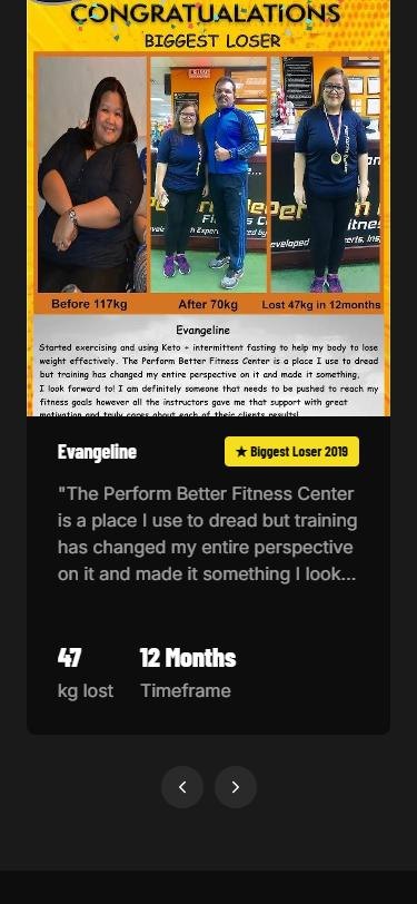
Numbers over adjectives: each of the 14 stories pairs a real before-and-after photo and a short quote with two big figures, kg lost and timeframe, plus a badge like "Biggest Loser 2019". "47 kg in 12 months" does more than "life-changing results".

14member stories
47 kgtop result, in 12 months
Transformations section: Real people. Real results.
Member story card with quote, 47 kg lost and 12 month timeframe
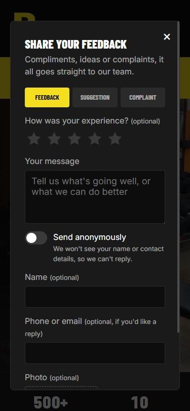
Share your feedback popup with Feedback, Suggestion and Complaint tabs
Decision 05 · complaints welcome

Make it easy to complain.

Complaints used to arrive as phone calls too. "Share Feedback" sits in the footer of every page and opens one short form, with Feedback, Suggestion and Complaint as tabs, so nobody has to work out where a complaint should go.

✓ Star rating and photo are optional, only the message is required✓ "Send anonymously" hides name and contact, and says plainly that means no reply✓ Every message lands in the owner's admin inbox, not his phone✓ After sending, everyone sees "Review us on Google", not only happy customers
Decision 06 · the owner is a user too

An admin hub built for someone who isn't techy.

The site's second user is the owner. I designed the editing side to be simple and direct, on a no-code platform that stays free.

✓ Edit headings and text in place✓ Add, swap or delete photos and videos✓ Update offers and timings✓ Ready-made message templates he can tweak✓ Publish changes live in one step
An idea I dropped

A technical tour, by muscle group.

My first idea walked visitors through the gym by equipment and muscle category. I dropped it because most members aren't fitness professionals. The local crowd wants to find timings, classes and prices quickly, not read a spec sheet.

The look stayed yellow, black and white with heavy type and motion, and every moving element points the eye toward the free trial.

Early feedback

Friends, family and colleagues who tried the site said it felt like a premium gym website.

What I'll measure

Fewer enquiry calls to the owner, and more free-trial requests coming through the site and WhatsApp.

Hardest part

There weren't good-quality photos or videos of the gym to work with.

What I learned

Designing the editor mattered as much as designing the site. A beautiful page that nobody can update goes stale in a month.

← All work
Case study · UX audit + redesign

Playo

I searched “swimming pool”. Playo took me to the Games tab. So I checked whether other players felt the same, listed every UI and UX problem I could find, and redesigned the app to fix them.

ROLEResearch and design, solo
TIMELINENovember 2026
METHODSSurvey, heuristic audit
TOOLSGoogle Forms, Figma
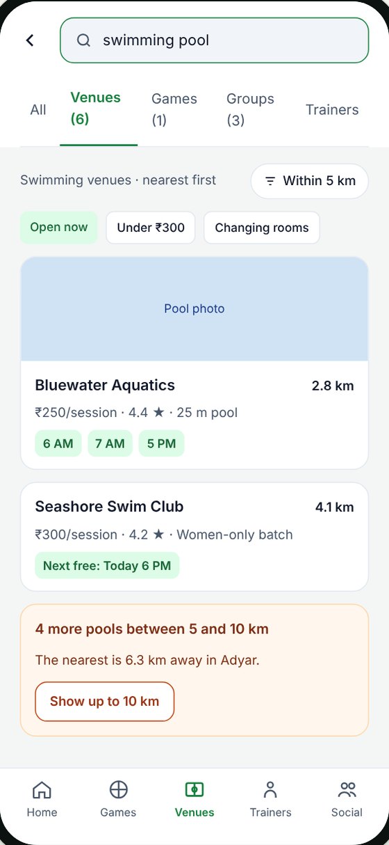
Redesigned search results for swimming pools
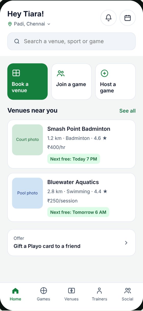
Redesigned Playo home with Book a venue
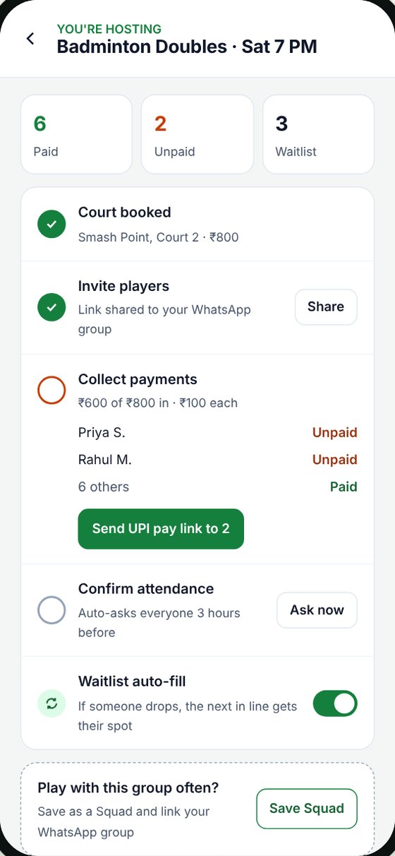
New hosting hub for a badminton game
In short
Problem

Finding a venue on Playo is confusing, and hosts chase players on WhatsApp for headcounts and money.

What I did

Surveyed players, audited five screens against Nielsen's heuristics, and mapped nine friction points across the journey.

Result

Six redesigns that solve all nine, from search that understands intent to UPI payments for hosts.

How I worked

From a bad search to a better app.

Step 01

Noticed a problem

while booking venues and hosting games myself.

Step 02

Checked if it was just me

with a survey of friends who play.

Step 03

Listed the problems

screen by screen, then mapped nine friction points.

Step 04

Redesigned the UI

so every friction point is solved.

Step 01 · where it started

A search that reads words, not intent.

I'm a regular Playo player with 26 games played. I use it two ways: to find and book venues, and to host sessions for my group.

When I typed “swimming pool” into the Home search bar, Playo took me to the Games tab, not to pools. Venues that did show up weren't sorted by distance, so I ended up opening Google Maps instead. Hosting had its own problems: people joined, then didn't show up, and I chased everyone on WhatsApp for reminders and money.

What I gotThe Games tab

Games to join, and no pools.

What I wantedA pool 2.8 km away

Free at 6 AM.

The search matches words, not intent, and ignores where I am.

Step 02 · is it just me?

Every user felt it too.

I shared a Google Forms survey with friends who play. 6 people answered: 3 Playo users, all of whom also host, and 3 non-users. It's a small sample, but every user echoed what I'd felt.

2/5

Lowest score for how easy it is to find and book a venue, the most common use.

3/3

Hosts collect money after the game on UPI and send reminders on WhatsApp.

0/3

Users who use Squads. Their groups run on WhatsApp.

2/3

Non-users who had never heard of Playo.

“I once hosted a game, I got many requests which made me two courts for Badminton. And it turned out that a few players did not show up.”Sandeepan, host

“Make the venue findability easier.”Samreen, player

Public reviews agree: an analysis of Playo's Google Play feedback gives it a Net Promoter Score of -16, with complaints that booking is hard to find.

Who I'm designing for

Three people, built from real answers.

The Venue Booker · 25–34Priya

“I just want a court or pool near me with a free slot.”

Goal: find a nearby venue with a free slot, fast.
Frustration: search misreads “swimming pool”. Rates booking 2 out of 5.

The Pickup Host · 25–34Arjun

“Everyone says they're in, I book two courts, and half don't turn up.”

Goal: know the real headcount and get paid without chasing.
Frustration: pays for empty courts, chases money on UPI after every game.

The WhatsApp Regular · 18–24Karthik

“My group already plays every week. Why move to an app?”

Goal: play with the same group, no extra effort.
Frustration: never heard of Playo. Everything happens on WhatsApp.

Step 03 · heuristic audit

Promotions get the best space. Booking gets buried.

I went back through the app screen by screen and checked each against Nielsen's usability heuristics. The same pattern showed up everywhere.

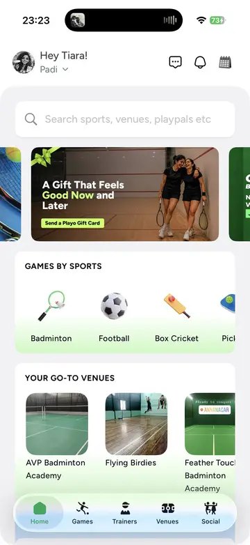
Current Playo Home screen

Home

  • No button to book a venue. A gift card banner takes the top.
  • Search matches text, not intent, so “swimming pool” opens the Games tab.
  • Venue cards show no distance, price or free slots.
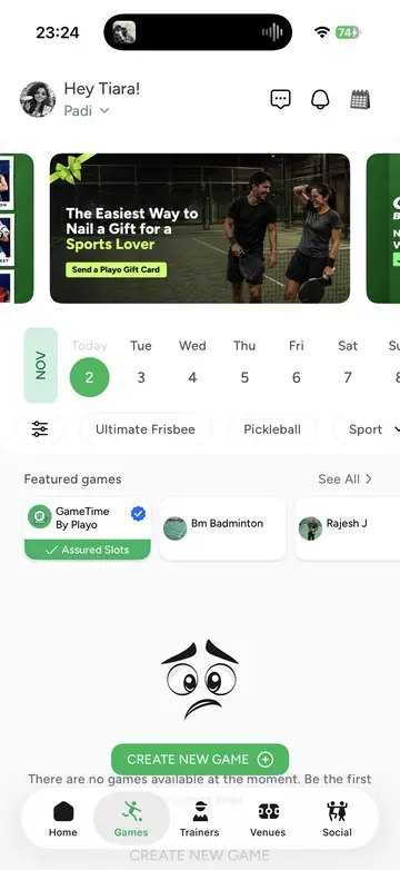
Current Playo Games screen with an empty state

Games

  • The “Create new game” button overlaps the empty-state text.
  • A dead end: no other days, sports or notify option.
  • A promo banner sits above the date picker.
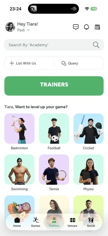
Current Playo Trainers screen

Trainers

  • The green “TRAINERS” bar looks like a button but does nothing.
  • “List With Us” and “Query” are business actions in a player’s space.
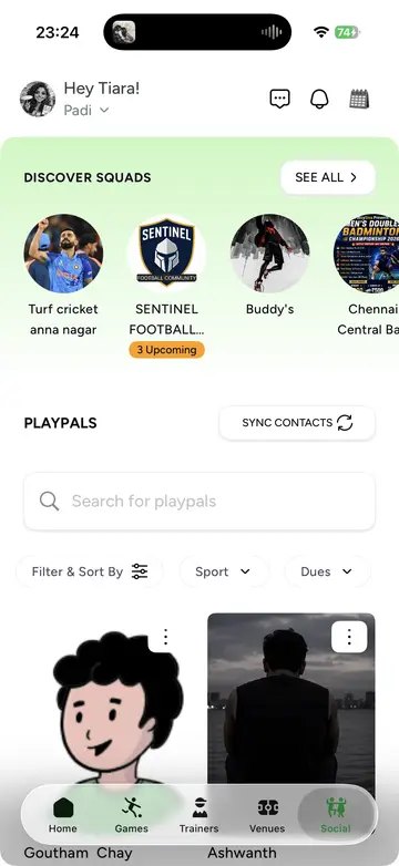
Current Playo Social screen

Social

  • No way to collect or track payments for a game.
  • A squad uses a celebrity photo, so groups are hard to trust.
Current Playo Profile screen

Profile

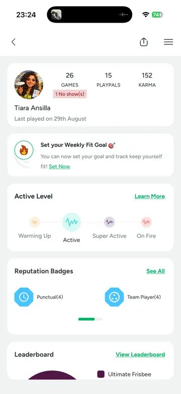
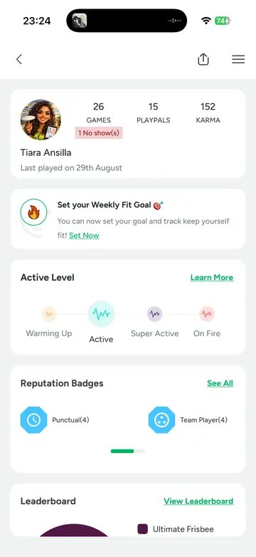
  • The red “No show” tag doesn’t say when, why, or how to clear it.
  • Karma and badges show here, not on game cards where people decide.
Friction points

Nine places people get stuck, in journey order.

HIGHblocks the task or costs moneyMEDslows people down
Find
F1 · HIGHSearch opens the Games tab, ignores distance
F2 · HIGHSwimming and non-court sports are thin
F3 · MEDNo “Book a venue” action on Home
Choose
F4 · MEDCards lack distance, price, free slot
Join
F5 · MEDEmpty state is a dead end
F6 · HIGHFree join, so headcount is a guess
Game day
F7 · HIGHNo confirm step or waitlist
Settle
F8 · HIGHNo way to collect or track payments
Group
F9 · MEDSquads can’t link to WhatsApp
Step 04 · redesign

Six changes, all nine solved.

Some changes add what's missing, like payments. Others make what Playo already has visible when people need it.

Redesigned search results: swimming venues, nearest first
Change 01 · solves F1F2

Search that understands what you mean.

Change: “Swimming pool” is read as a venue search. Pools show first, nearest first, with tabs for Venues, Games, Groups and Trainers. If nothing is close, it offers the nearest and a wider radius, never a different tab.

Why: People search in everyday words, not Playo’s categories. Venue booking is the most common use and scores lowest, so this fix matters most.

Change 02 · solves F3F4

Book from Home, with cards that answer the real questions.

Change: Book a venue, Join a game and Host a game sit at the top. Nearby venue cards show distance, price and the next free slot. The promo moves below.

Why: Players rank distance, price, surface and slots highest. Showing them on the card means no tapping into each venue to compare.

Before
Playo home before
After
Playo home after
Before
Playo games empty state before
After
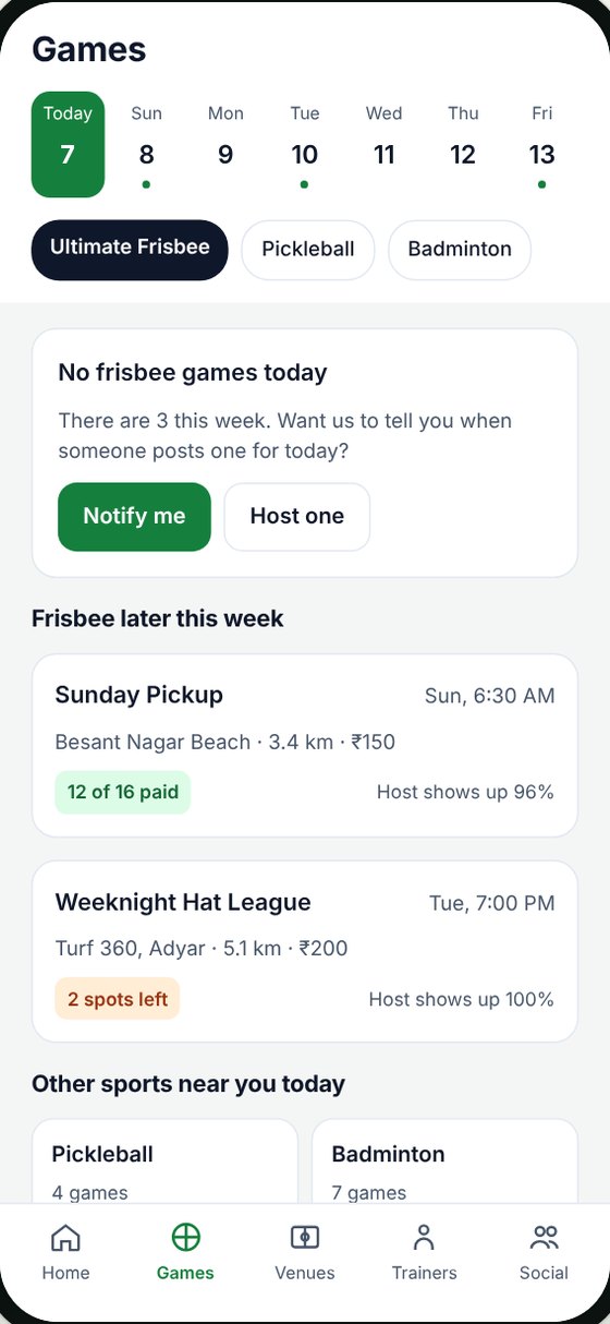
Playo games empty state after
Change 03 · solves F5

An empty state that keeps you playing.

Change: No frisbee today? Notify me, games later this week and other sports nearby come first, with Host one as the second option. The overlapping text is fixed.

Why: Players already work around the dead end by checking other days, asking on WhatsApp or switching apps. The app should do that for them.

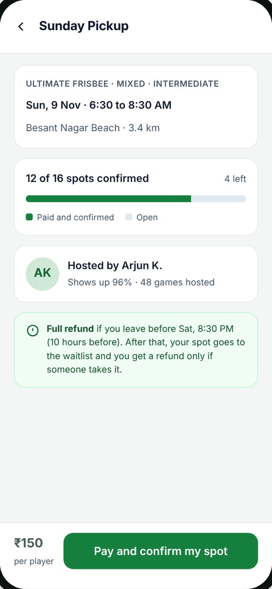
Change 04 · solves F6

Pay to confirm your spot.

Change: Hosts can collect upfront. Joining becomes “Pay and confirm my spot”, the bar shows paid spots, and the refund rule is clear before you pay.

Why: A free tap costs nothing to break. 2 of 3 users picked paying upfront, and it gives hosts a real headcount before booking a second court.

Game details with Pay and confirm my spot
Hosting hub with paid, unpaid and waitlist counts
Change 05 · solves F7F8F9

A hosting hub inside every game.

Change: Paid, unpaid and waitlist counts at the top, then a checklist: invite on WhatsApp, collect with a UPI pay link, confirm attendance, waitlist auto-fill. Repeat groups can save as a Squad linked to WhatsApp.

Why: Every host runs money and reminders outside Playo because the app gives them no way to. Building it into the game keeps the whole session in one place.

Change 06 · smaller fixes

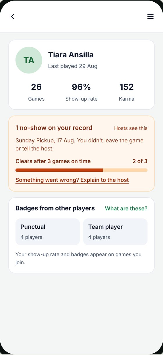
A no-show tag you can understand and clear.

Change: the tag says when and why, shows progress towards clearing it, and lets you explain to the host. Show-up rate sits next to Karma.

Why: a bare red tag punishes without helping. Showing the path back encourages people to turn up.

  • Trainers: the green bar becomes a plain heading, so it stops looking tappable.
  • Trainers: “List With Us” and “Query” move into the profile menu.
Before
Playo profile before
After
Playo profile after with a clearable no-show tag
Next steps
  1. Grow the survey to 20–30 responses through pickup and frisbee groups.
  2. Interview a host about over-booked courts.
  3. Prototype the top three changes and test with 3–5 players.
  4. Re-ask the venue and hosting ease questions to measure the change.
What I learned
  • Check what a feature does before designing around it. Verifying each feature in the app kept my audit honest.
  • Design for where people already are. Hosts won't leave WhatsApp, so the redesign connects to it.
  • My frustration was a lead, not proof. It only mattered once other players described the same problem.

Concept case study, not affiliated with Playo. Redesigned screens use sample venues, prices and players.

← All work
Case study · website design · Figma Make

DISCOURT

Giving a free Saturday frisbee session the wow factor of a run club.

Discourt is an open-for-all Ultimate Frisbee session at Besant Nagar Beach, Chennai. I host the sessions, so I designed the site from the sand up: for the person nervous about their first game, and for the companies who want to bring their teams.

Visit the site ↗
ROLEDesign, copy and build
TOOLSFigma Make, AI-assisted
INSPIRED BYChennai run club sites
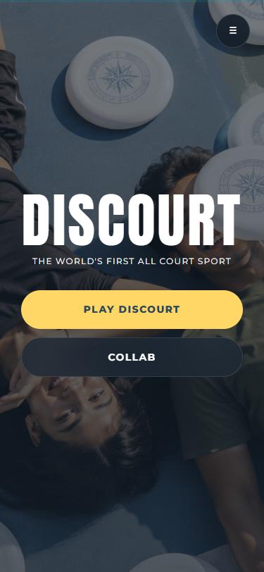
Discourt home screen with Play Discourt and Collab buttons
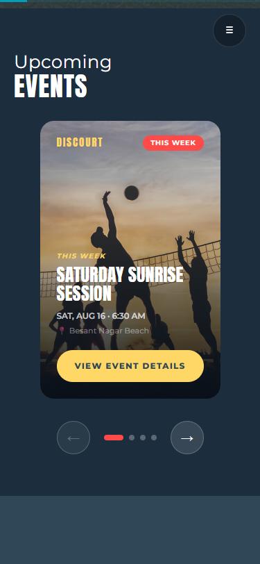
Upcoming events card carousel
The challenge

"Free and open" doesn't feel like enough.

People think Ultimate Frisbee is for teams and experts. Newcomers weren't sure they'd fit in, and companies didn't know they could book it. Run clubs solve the same problem with sites that feel like a scene you want to be part of. Discourt needed that energy, plus clear answers: when, where, and "can I just show up?"

NewcomersNeed to know they're welcome, with no experience or team.
RegularsWant the next session date, fast.
CompaniesWant to collab or book a session for their team.
Decision 01 · the first screen

Two doors, straight away.

The hero is just the name, one line, and two big buttons: Play Discourt for players, Collab for brands and companies. Each audience finds its path in the first second, before any scrolling.

DISCOURTTHE WORLD'S FIRST ALL COURT SPORTPLAY DISCOURTCOLLAB
Decision 02 · events as cards

Every Saturday, its own poster.

A plain list of dates says nothing about the vibe. Borrowing from run club event cards, each session is a swipeable poster with a tag that says who it's for, so a beginner can spot "All levels" and a regular can spot "Tournament".

THIS WEEKSATURDAY SUNRISE SESSION
ALL LEVELSOPEN COMMUNITY PICKUP
SOCIALDISC & DUNES MIXER
TOURNAMENTFOUNDERS CUP INVITATIONAL
Decision 03 · building trust

Show the people, not just the sport.

A free session asks for trust instead of money. So the page stacks up proof: animated counters, brands we've played with, the real team behind it, and the values we play by.

Counters

Sessions hosted, players and years running count up as you scroll in.

Worked with

A two-way marquee of Decathlon, Sporthood, Madras Race Club, Oro Money and more.

Flip cards

Team cards flip to show each person's personality, not just a job title.

What we play by

Five values, from gender equality on the field to fun above all.

Visual language

Sunrise on the sand.

Deep sea navies with a sunrise yellow for every action, a coral red for urgency, and teal for the water. Anton gives the sporty poster shout, and Montserrat keeps the details readable. My animation habits show up in the small stuff: a disc-shaped cursor and scroll-in counters.

#FED766
#FE4A49
#009FB7
#365370
#2F4858
What's next

Phase 2 adds a streak tracker with discounts for consistent players, a calendar of attended events, and referral rewards.

What I learned

Being the host made me the best user researcher on the project. I'd heard every first-timer's worry in person before I designed for it.

← All work
Case study · product design · Being Ultimate

Being Ultimate app & WhatsApp bot

One home for a growing Ultimate Frisbee community: book games, join leagues, watch highlights and shop for gear. Plus a WhatsApp bot for everyone who'd rather just send a message.

View the Figma file ↗
ROLEProduct and UI/UX design
TOOLSFigma, FigJam
STATUSDesign concept, not shipped
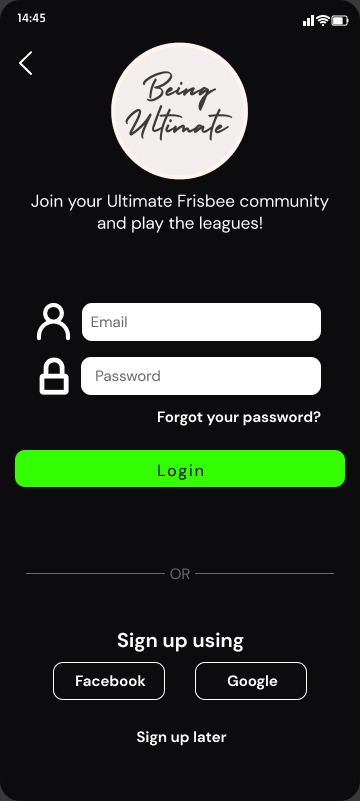
Login screen
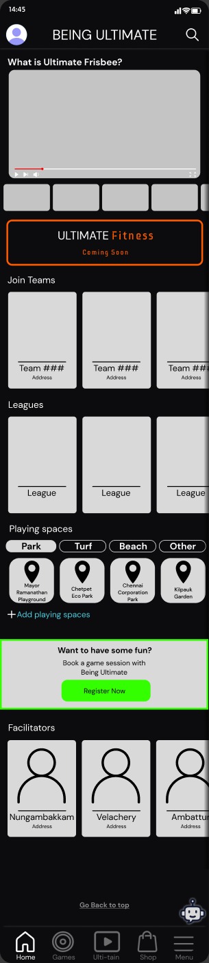
App home screen
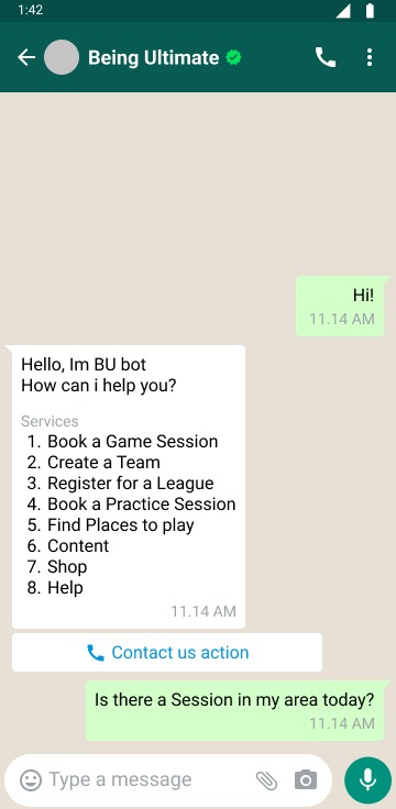
WhatsApp bot services menu
The challenge

Everything lived in a different chat.

Being Ultimate runs sessions, family leagues, corporate events, content and merch. I work there, so I saw it daily: people found us through WhatsApp forwards, Google Forms and payment links, and every question landed in someone's DMs. Newcomers didn't know what Ultimate Frisbee even was. Regulars had no place to see their team, their games or their photos.

NewcomersNeed to understand the sport before they'll book.
PlayersWant teams, leagues, games and bragging rights.
FamiliesWant to register, pay and get photos, fast.
Before the screens · information architecture

I storyboarded it first, in FigJam.

Before drawing a single screen, I mapped the app's structure and every journey someone could take, including the unhappy paths: "don't wish to continue", "change details", "quality check failed". One rule shaped all of it: people on the app should be able to use WhatsApp instead, and WhatsApp-only people should never be forced onto the app.

App sitemap
Home
What is Ultimate?
Join Teams
Leagues
Playing spaces
Facilitators
Games
Leaderboard
Find: leagues, skill, coach
Your team
Schedule game
Friends activity
Ulti-tain
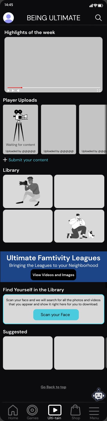
Highlights of the week
Player uploads
Library
Find yourself (face scan)
Shop
Deals for you
Frisbee gear
Sponsors & partners
Menu
Profile & rewards
Ultimate Fitness
Settings
FAQ · Report
Eight bot journeys, each mapped end to end
Book a sessionFind a communityFind a facilitatorBuy merchandiseFind a league (in season)Upload my contentAssess my wellnessCheck my reward points
Example flow · book a session (V2)
"Hi"→Share area or pin code→In a community? Yes: show your teams. No: pick a venue→Pick a slot→Number of players→Confirm and pay→Receipt, plus facilitator details

The bot checks whether you already belong to a community first. Families who do skip straight to their teams, and new people get venue options instead. At every step there's a way out or back.

Trust, built in

Facilitators are verified

Players who want to coach pick their areas and time slots, submit ID and go through a background check. They get an email either way, selected or not.

Safe by default

Uploads pass a quality check

Player content comes with guidelines, the game's date and location, and who's in it. If it fails the check, the uploader gets told why and can try again.

Beyond the game

A wellness check-in

A short chat quiz on fitness, sleep, diet and mental wellness, ending in a summary and tips, which laid the groundwork for Ultimate Fitness.

Iterating with review

What changed in V2

Check who you are first. The facilitator flow now checks if someone is an existing user before asking them to register, not after.

Ask what to change. In Buy Merchandise, "change details" now asks whether it's the item, the size or the quantity.

Close every loop. Payment for pickup orders too, and a clear selection or rejection email after background checks.

Decision 01 · home is an onboarding

"What is Ultimate Frisbee?" comes first.

Most people who download the app have never played. So Home opens with a short explainer video before anything else, then shows teams to join, leagues and playing spaces filtered by Park, Turf or Beach. A bright "Want to have some fun? Book a game session" block turns curiosity into a first booking.

Decision 02 · games makes it social

Schedule a game in one card.

Date, time, place, your players and the opposing team all fit in one form, with players added as tags. A leaderboard and a friends' activity feed give people a reason to come back between sessions.

Full home screen
Games screen with leaderboard and schedule a game form
Ulti-tain screen with Scan your Face
Scratch card reward
Decision 03 · find yourself

Scan your face, get your photos.

In Ulti-tain, you scan your face once and the library shows every photo and video you appear in, ready to download. Player uploads and weekly highlights keep the feed full.

Decision 04 · reward showing up

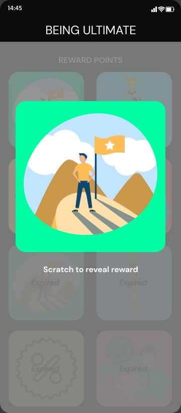
A scratch card, not a points table.

Playing, uploading and giving feedback earn rewards you redeem in the Shop. Revealing one is a little animated moment you scratch to open. Expired rewards stay visible but faded, so people know to use them sooner next time.

The WhatsApp bot

Say "Hi", get a game.

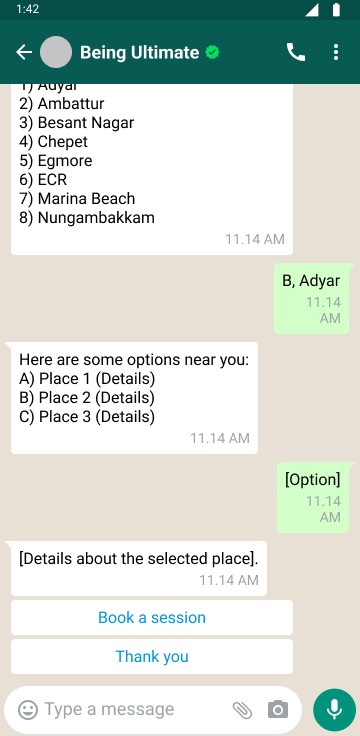
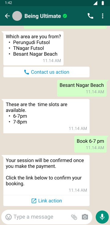
Not everyone will download an app, but everyone in Chennai is on WhatsApp. The BU bot answers with a numbered menu of services, and handles plain questions like "Is there a session in my area today?" too. It asks one thing at a time, area first, then time slot, and ends with a payment link to confirm.

Bot greeting with its services
A clear menu, plus room for free text
Booking by area and time slot, then a payment link
Area, slot, pay, booked
Find places to play by neighbourhood
Find a place nearby, then book it
Nudging toward the app, gently

The bot never forces a download. It suggests the app at natural moments: after the first booking, after feedback, and before payment with a small discount.

Where it landed

The app didn't go into production. The flows became a shared map of every way someone reaches BU, from outside WhatsApp to inside the app, and every payment we'd need: sessions, programs, leagues, merch and sponsorships.

What I learned

Designing from inside the company meant I already knew the questions people asked, because I was the one answering them.

← All work
Case study · M.Sc project · UX research

Sowcarpet Bazaar

A guide to one of Chennai's busiest markets, street by street.

Sowcarpet is packed with shops, history and bargains, but there's no single place to find where anything is. I designed an app that helps locals and first-timers find shops, products and the stories behind the streets.

View the Figma file ↗
ROLEResearch, UX and UI
TOOLSFigma, Illustrator, Google Forms, ChatGPT
WHENM.Sc, 2022–2024
Splash screen with an illustrated market stall
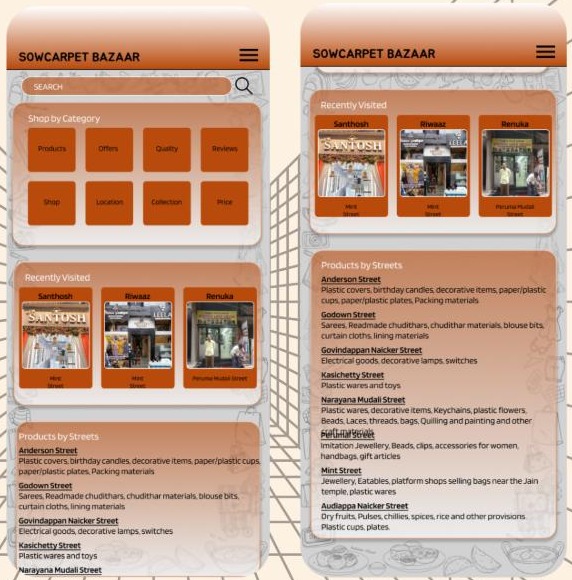
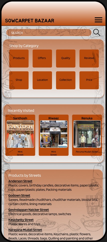
Home: search, shop by category, recently visited
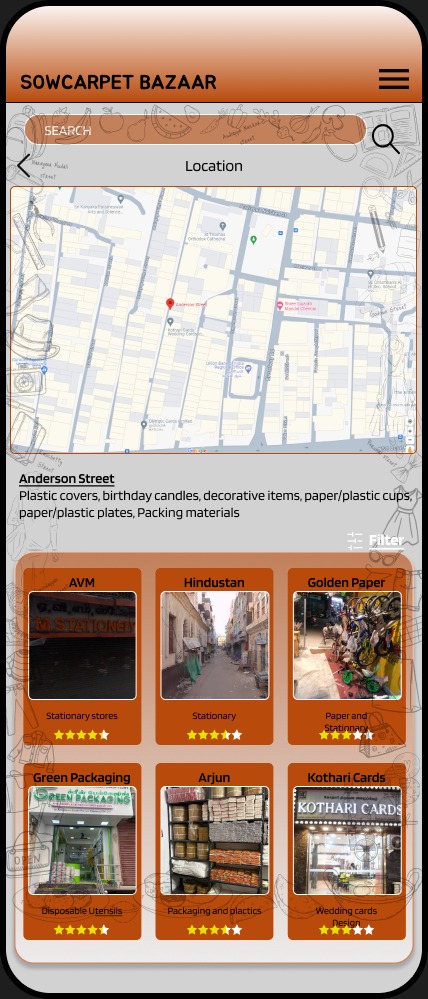
Anderson Street location with map and rated shops
The problem

A thousand shops, no map.

Customers find the market hard to navigate efficiently.
Finding the best shops takes so long that visitors give up, and local vendors lose business.
There's no central place for Sowcarpet's history and culture, so visitors never connect with the area.
Hypothesis

One guide with routes, shop details and products will make shopping easier, bring more customers to local vendors, and deepen people's connection to the market.

Research

Six kinds of shopper, one market.

A survey and secondary research showed that people come to Sowcarpet for very different reasons. A retiree with a whole afternoon shops nothing like a business owner restocking wholesale, so each became a persona the app had to serve.
Six persona cards
AthreyRetired, 60–80Has time to explore and shops for his grandchildren.
SteveStudent, 18–23Comes with friends for fun and budget finds.
VimalEmployee, 22–60Knows exactly what to buy for his family.
SushmaHomemaker, 30–50Buys fruits and nuts in bulk and knows where to go.
MirdulaFestive shopperSpends a whole day shopping for everyone.
PratikshaBusiness ownerBuys wholesale and compares quality and price.
Paper first

Sketched by hand, then built in Figma.

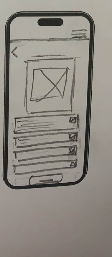
Before any pixels, I drew the screens in pencil on printed phone frames: the About and FAQ pages, the shop owner login, and the shop owner's own page. Sketching is still the fastest way I know to find out what a screen needs, the same way I'd thumbnail a storyboard before animating a scene.

Pencil sketch
Pencil sketch of the shop owner page: a photo, four rows with edit icons and a button at the bottom
→
Final screen
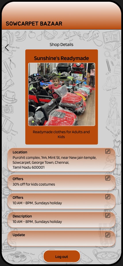
Final shop owner page with a photo, editable cards and a Log out button
Four pencil sketches on printed phone frames: two text pages, a login with two fields, and the shop owner page
Decision 01 · how people actually search

Three ways in: category, street, shop.

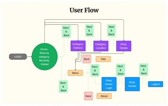
Some shoppers know what they want, some know which street, and some remember a shop they visited once. The home screen offers all three, plus Recently Visited, so nobody has to start from zero.

User flow from home to categories, locations and shop details
Street location screen
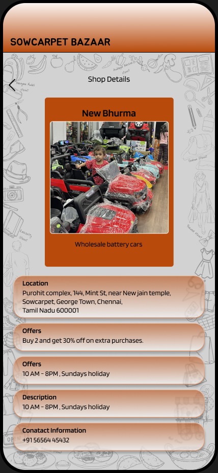
Shop details with address, offers, hours and contact
Decision 02 · the street is the unit

Organised the way locals already think.

Locals don't say "stationery section", they say "Anderson Street". Each street gets a card listing what it's known for, from wedding cards to wholesale toys. Tap one for a map, its shops with star ratings and a filter, then a shop page with the address, offers, timings and contact number.

Decision 03 · vendors are users too

Let shop owners keep it fresh.

A market guide goes stale the moment an offer ends. So shop owners log in to their own page, which looks just like the one shoppers see, with an edit button on every card. They can update location, offers, timings and descriptions without learning anything new.

What shoppers see
Shopper view
What the owner edits
Owner view with edit buttons
Visual language

Terracotta, brass and hand-drawn streets.

The palette borrows from old storefronts and brass vessels. Blinker keeps small shop names readable, and every presentation board uses my own line illustrations of the market. That's where the animator in me snuck in.

#DBB47B
#B84A0B
#D2D2D2
#000000
Style sheet with palette, type scale and tools
ProcessSurvey→Secondary research→Personas→User flow→Paper sketches→Task flow→Style sheet→Mockups
What I learned

Walking the streets myself mattered more than any competitor app. The street-first structure came from watching how people gave directions, not from a template.

← All workCollege projects · Loyola College · 2021–2024

Earlier app concepts.

Two more college projects: Barath Health from my final year of B.Voc 3D Animation, and Wardrobe Donation from my M.Sc in Visual Communication. They're where my first real user flows and prototypes came from.

M.Sc project · mobile app

Wardrobe Donation

Make someone's life better by donating clothes.

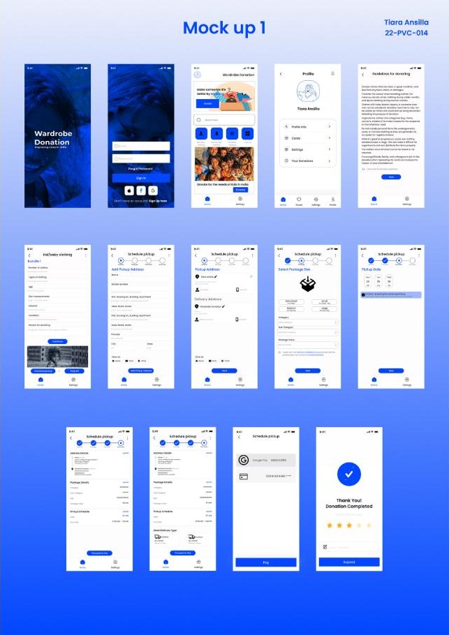
Most people have clothes they'd happily give away, but don't know where or how. This app turns a vague good intention into a few steps: choose what you're donating, schedule a pickup, and get a thank-you when it's done.

A stepper, not a formScheduling a pickup is split into address, package size, date and review, with progress always visible at the top.
Guidelines before givingA donation guide sets expectations on condition and cleanliness, so NGOs get clothes they can actually use.
A proper endingThe flow closes on "Thank you! Donation completed" with a quick rating, so giving feels finished, not forgotten.
Wardrobe Donation mockups
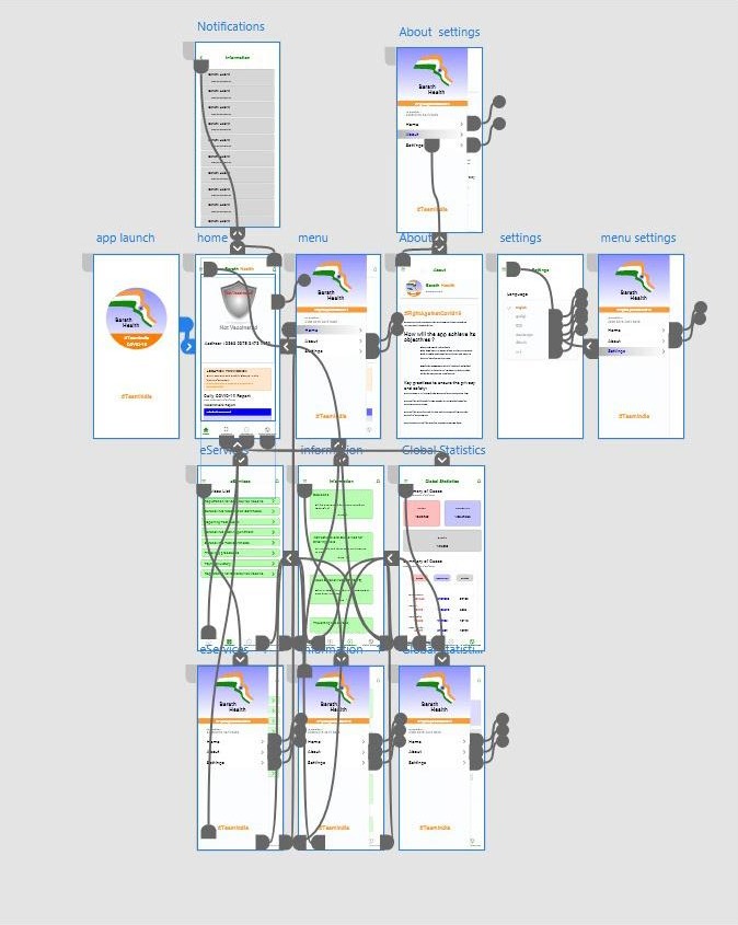
Barath Health prototype map
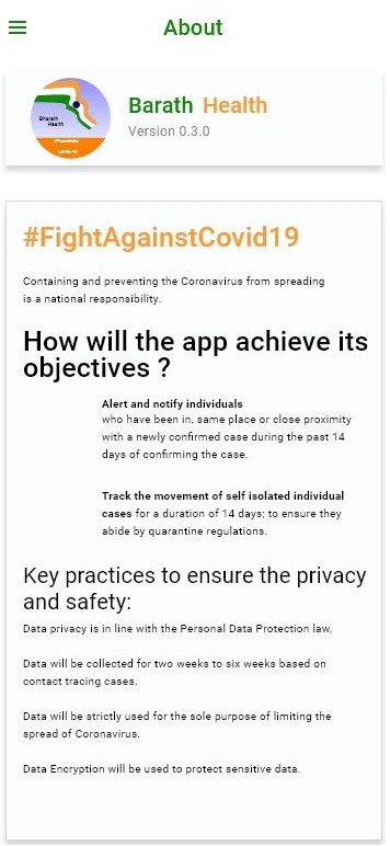
Barath Health logoAbout screen explaining privacy practices
B.Voc final year project · prototype

Barath Health

A COVID-19 companion app, #FightAgainstCovid19.

My first clickable prototype. It brings vaccination status, daily COVID-19 reports, government eServices and global statistics into one app, with alerts for people who'd been near a confirmed case.

Status firstYour vaccination status is the first thing on the home screen, with the day's report right below it.
Privacy said out loudA tracing app asks for a lot of trust, so the About screen spells out how long data is kept, what it's used for, and that it's encrypted.
Four-tab navigationHome, eServices, Information and Global Statistics, each one tap away.